 All of us, at some time, have been turned off by a website experience that is just too demanding of information and this occurs no more frequently than during the grim sign-up process.
As a digital blokey I have sat in client meetings when they explain, at huge length, that the web sign-up form “simply must have title, first name / second name as three different fields”. Oh, brother. This all happens because the client is in charge of the process and not the visitor and the client thinks she or he knows best. Or it’s an operational / information function, that “to blah blah blah we need to have blah blah to stop spam and false enquiries blah, blah blah”.
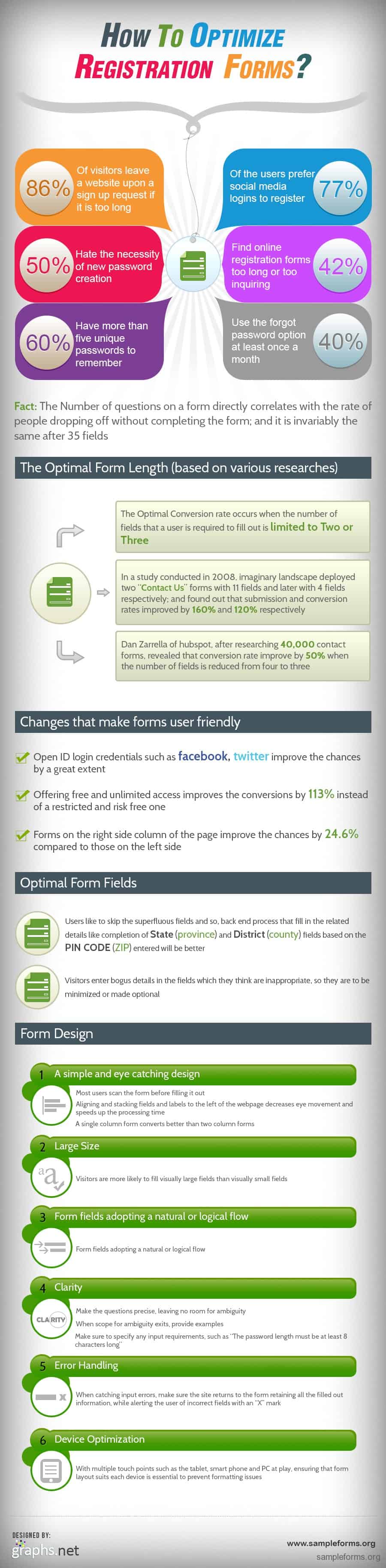
Quite right, we do need to make sure we get quality sign-ups and we would love to avoid too much spam but are we going to lock the doors so tightly that genuine interested visitors are turned-off or turned away? Stephanie, at Sampleforms.org, late last week, sent me a great infographic which is designed by Infographics (on the right of this post) it neatly sums up the main areas you should focus on when considering using sign-up systems.
The key takeaways from this are:
- Focus on the needs of visitor, they are there to carry out a function so help them along that journey.
- Make the sign-up flexible to device size, touch and location. Be aware that they may not be on ultra-fast fibre broadband with a 27″ iMac. They may be trying to complete an important (and revenue generating task) on a smartphone with marginal 3G connectivity.
- KISS. Simple design, clarity and a nice easy flow will pay dividends (pun intended)
- Think social. Most folks have logins already, for Facebook, Twitter, Google plus, LinkedIn etc – is it viable to use linked logins? It usually is.
- Fewer form fields. You have too many form fields, I promise, even without looking. Less is more and the ideal number of fields is 1, 2 or maybe 3 at a push. You don’t actually need most of the data anyway, not really.
- Use an offer, something that is FREE or NO OBLIGATION or NO COST. People like free stuff.
Adhere to these simple rules and apply them correctly and your sign-up forms will work better, convert more and alienate fewer potential customers.
What’s missing is where the learning came from. Critically, you need to view sign-up forms as evolving creatures – they will change over time; you won’t reach a stage where you have the ideal version and stop it’s a continual evolution process and that entails testing, idea evaluation and a highly agile approach to delivery.
You might also consider slaying a sacred cow or two along the way. What worked in the past doesn’t stay working forever. I’ve seen my fair share of clients getting stuck in a rut and simple repeating what they did the year before and expect huge improvements. You must adopt a forward looking focus, take some chances and be brave.
Thanks again to Stephanie and here’s the link back to the original post and it’s excerpt: “The infographic deals with the website form data optimization to encourage the visitors fill in the forms, so as to improve the submission and conversion rates. It deals with the mindset of the majority of visitors, optimal form length and design, use of social media logins and some more improvements.”
by Martin Dower