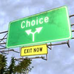
 Supposedly, humans are terribly lazy, easy to manipulate and creatures of habit. That’s great news if you can leverage these traits to help your online campaign. Traditional wisdom states that people should be offered lots of choice. This is plain wrong, too much choice creates procrastination.
Some say providing choice is a fundamental part of building trust in the online world but everyone is different and not just down to the choices they make but how they make. It, therefore, makes perfect sense to offer visitors some choice but a good dose of pre-making some of the choices seems intelligent. Refining this is the study of defaults; the standard settings that people will simply accept and move on.
There are some really good best-practice defaults that should be probably be used. Examples included are not showing an event in the past or offering a service that has been repeatedly refused. This is mainly common sense and most web-sites are (or should be) doing this now. Good defaults don’t force the visitor to think to much about choice or clicking, they simple ease the visitor onto the next step.
How questions / fields are worded makes a big difference to how they are perceived: The theory that framing a question not only illicits an answer but also changes the thinking of the participant prior to answering the question. Avoiding a heavy psychology lesson here, but we can make a marked difference (aka: improvement) in visitor behaviour and conversion by framing the questions differently.
So lets get rid of pointless choice questions, these might be “needed” for your organisation but have little or no bearing for most people. A good example of this is requesting a person title (Mr, Mrs etc) – people don’t use titles these days and it simply adds another hurdle into the conversion process.
Incentive-based defaults
People tend to respond well to some form of incentive so default ticking the box marked “Please enter me into your draw to win a free iPad” would make sense. In fact, it would be rather nuts to have the box not ticked as default. The same would apply where the incentive is a value-trade on the web-site such as “Please send me an electronic guide”.
In many of these cases what we see happening is a value-trade whereby the visitor exchanges her details for some item or service. Where the provision of this item or service has a close-to-zero cost then the default should be ON (i.e. ticked) by default.
The same does not apply when we use discounting. This has a cost and unless the visitor needs tipping over the balance point it would be crazy to hand out discounts to everyone so take great care with cost-based offers.
Push defaults
As web marketeers we are always looking for ways to improve the online conversion rate. Pushing people down a path is one way to do that and works, again, because people are really rather lazy (proper psychologists call this the status quo bias).Lets look at the typical “Thanks” page; it’s the end of one stage of the customer journey and therefore the beginning of the next stage but how many pages simply say thanks and offer no further actions. We’ve all seen these, they are the dead-ends and cul-de-sacs of the web world.
Adding actions at these stage markers is a simple and highly effective method to keep the visitor moving along. Not only are they at the boundary of two stages they have also committed time and effort to complete the previous stage. Lets, then, capitalise on this momentum and offer the next along, with suitable incentives.
This is only a short article on what it a pretty large subject, contact me if you want to find out more, but it does show that some simple thinking about how and when you lay out your calls-to-action can make a huge difference to stage and overall conversion rate in the online world.
